Made with this app
AI Infographic Generator turns a title and a short list of figures into a finished flat infographic, drawn in true proportion, without a spreadsheet, a design tool or a template. Type your title, enter your data one figure per line, choose a chart format from the library, and the app returns clean vector-style artwork sized up to 4K. It is built for anyone who needs to communicate numbers visually, from analysts preparing slide decks to educators making handouts, without touching design software.
How to use this app
- 1
Upload your file. There is no prompt you have to write.
- 2
Pick a look from the visual library, add a note of your own if you want one, then press Generate.
- 3
Watch your result appear in the gallery within moments.
- 4
Download, share, or generate again with a new idea.
What you can make
Survey results for a slide deck
Type a question as your title, enter each response percentage on its own line with a label, and choose "Bar chart" for a clean side-by-side comparison. The proportional bars make it immediately readable on a projected slide without any further formatting.
Market share breakdown
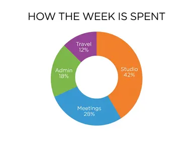
When your figures are parts of one whole, "Donut" draws each segment to fill the ring exactly once in proportion. A title like "Global streaming share 2024" with four or five labelled figures produces a chart ready to drop into a report or a pitch deck.
Step-by-step process diagram
Onboarding flows, editorial workflows or project phases all suit "Numbered steps". Type each stage as a short labelled line in the order it happens, and the app returns numbered blocks connected by arrows, clear enough to share in a document or print on an internal handout.
Timeline for a project brief
Key milestones, historical events or product launch phases laid out as a horizontal spine work well with "Timeline". Each entry lands beside its own marker in the order typed, in a restrained editorial palette that reads clearly without competing with surrounding text.
Technical specification panel
"Data panel" suits performance figures, sensor readings or benchmark comparisons where precision matters visually. White line work and monospaced labels on a dark grid give it a technical, credible look suited to product pages, data journalism or engineering presentations.
Shots to try
Tips for better results
Match the chart to your data structure
Parts of one whole belong in "Donut" or "Stacked bar". Independent comparisons read better as "Bar chart" or "Proportional circles". Ordered events or steps need "Timeline" or "Numbered steps". Choosing the right tile does most of the design work before anything is generated.
Keep each line short and complete
Each line becomes one labelled entry. Include the label and the figure together on the same line, such as "Mobile 47%", so the app has everything it needs to draw and annotate that entry correctly. A line with a figure but no label, or a label with no figure, leaves the chart ambiguous.
Four lines is a reliable working range
Testing confirmed that four labelled entries come back spelled exactly and drawn in the right order. If your data has more entries, consider grouping smaller items under a shared label before generating, rather than adding more lines and expecting the same precision.
Check proportions before presenting
The app draws figures close to true proportion, not calculated to the decimal. That is right for communicating a pattern or a comparison. If the exact height of a bar or the exact width of a segment will be quoted or measured by someone else, check the drawing against your source figures before you publish it.
When to choose this app
AI Infographic Generator is the right choice when you have numbers to communicate and need a proportional chart rather than a finished brand asset or decorative image. AI Logo Maker takes a brand name and returns a mark; AI Book Cover takes a title and returns a front cover. Neither is built to turn labelled figures into a data chart. Choose this app when the output needs to show relationships between quantities, ordered steps or timeline entries, presented as flat infographic artwork.
Frequently asked questions
How many data entries can I include in one infographic?
Four labelled entries is the range that has been tested and confirmed to come back accurate in both spelling and order. You can try more, but the more entries you add, the harder it becomes for the app to keep every label and proportion exactly as typed. Grouping smaller figures into a combined entry is a practical way to stay within a reliable range.
Does the app add axis labels, legends or percentage signs I did not type?
No. It writes your title across the top and your line entries as labels, and nothing else. It will not add an axis, a legend, a source line, a percentage sign you did not include, or any other text. If you want a percentage sign to appear beside a figure, type it into that line yourself.
Which tile should I choose if my figures are parts of one whole that add up to 100 percent?
"Donut" or "Stacked bar" are both designed for exactly that. "Donut" arranges segments around a ring; "Stacked bar" arranges bands left to right along one horizontal bar. Both fill their shape exactly once, in proportion to the figures you type.
Can I type labels in languages other than English?
Yes. The app has been tested with twelve alphabets, including accented Latin letters, Chinese, Japanese, Korean, Thai, Arabic, Hebrew, Hindi, Bengali, Russian and Ukrainian, and all came back character for character correct. An alphabet not on that list is not guaranteed, so test carefully before relying on it.
What is the difference between "Proportional circles" and "Donut" for showing relative sizes?
"Donut" shows figures as segments of one ring, which works best when they are parts of a single whole. "Proportional circles" draws separate discs whose areas reflect each figure, which suits comparisons that are not parts of one sum. One caution: people naturally read a circle by its width, not its area, so large differences between figures can appear smaller than expected in the circles view.
Will the app redraw a chart I already have if I describe it?
No. The app starts from an empty frame and draws only what you type into the two boxes. It cannot read an existing chart, a screenshot or a spreadsheet. If you want to recreate a chart, type the title and figures fresh into the boxes exactly as you want them to appear.
Do I need any editing skills?
No. Upload your photo, pick the look you want from the library, and the app writes the full instruction for you behind the scenes. There is nothing to install and nothing to configure. A small optional box lets you add one line in your own words, but the app works without it.
Can I use the results commercially?
Yes. Content you generate is yours to use, subject to our content licenses.
How long does a generation take?
Most generations finish in under a minute, and you can watch progress live in the gallery.